What Is Code Health? A Practical Guide to the 21 Markers
On this page
- A working definition
- Why aggregate scores hide problems
- Averages miss three common failure modes
- The 21 markers, grouped
- Complexity (7)
- Coupling (3)
- Test signal (5)
- Churn signal (6)
- A quick summary table
- Per-file scoring
- What to do when a file scores poorly
- Module rollup
- Rollup rules that work
- Reading a declining trend
- How to read the trend
- Worked example on a real repo
- Why a code health score needs context
- FAQ
- What is code health in software engineering?
- What are code health metrics?
- What are code markers?
- Is a code health score enough on its own?
- How do I improve code health without a big refactor?
- What tools help measure code health?
What Is Code Health? A Practical Guide to the 21 Markers
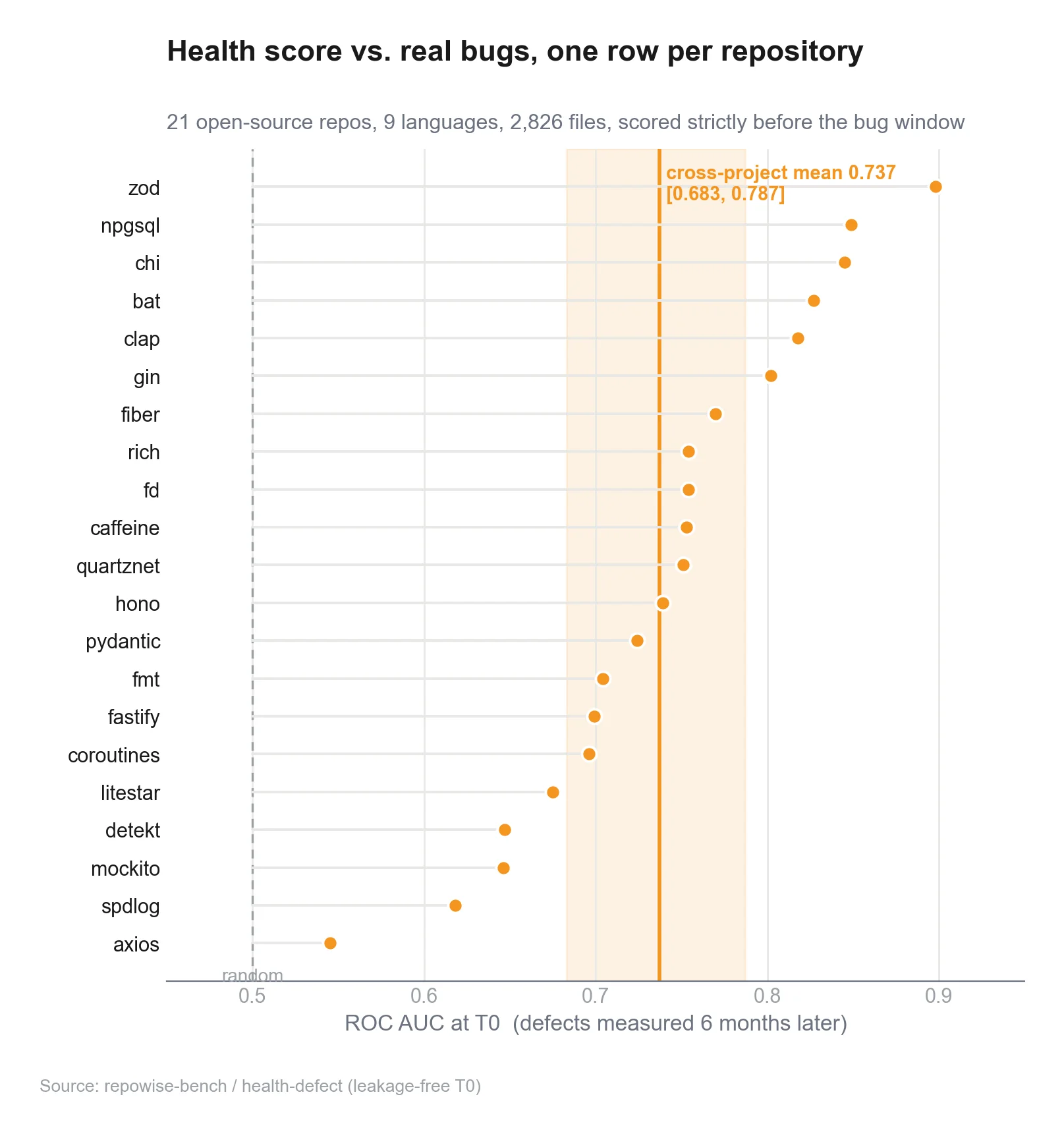
What is code health? It is the part of a codebase that tells you whether the system will stay easy to change next week, next month, and next quarter. Code health is not a vibe, and it is not a single score you can paste into a dashboard and trust blindly. In practice, code health metrics work best when they combine structure, dependency shape, testing signal, and repository history. That is the idea behind the 21 code markers that feed repowise's headline defect-risk score in this guide (a further 28 markers cover the separate maintainability and static-performance pillars, for 49 markers total). You will see how to read them, why aggregate averages hide trouble, and how to turn a weak code health score into a repair plan. For a live view of these ideas on a real repo, see our live examples. For the full picture, see the complete code-health guide.
Part of the Code Health guide.
A working definition
Code health explained in one sentence: it is a measurement of how much friction the code will create for the next change.
That sounds simple until you try to measure it.
A file can be short but tangled. A module can be clean but surrounded by fragile callers. A repo can have good tests and still be hard to change because the same few files absorb most edits. So the useful question is not “Is this code good?” It is “Where will future work slow down, and why?”
A practical definition needs four ingredients:
- Structure: how hard the code is to read and reason about.
- Coupling: how many things depend on it, and what it depends on.
- Test signal: whether changes are guarded by meaningful tests.
- Churn signal: whether history says this area keeps changing, breaking, or attracting risk.
Modern static analysis tools already measure pieces of this. SonarQube tracks maintainability, reliability, security, duplication, coverage, and complexity metrics in its analysis model. GitHub’s CODEOWNERS feature gives a simple ownership signal. MCP now has a current spec revision dated 2025-11-25, and the protocol’s working groups are still evolving the standard in 2026. (docs.sonarsource.com)
The problem is not lack of data. The problem is bad aggregation.
Why aggregate scores hide problems
A single repo-wide average makes unhealthy code look acceptable.
If one module scores 9/10 and another scores 2/10, the mean may look fine. That average can also improve while the actual risk gets worse, if healthy files get healthier and the truly fragile file stays ignored. CodeScene’s own product page calls out this exact failure mode: hotspots may be healthy, averages may hide low-scoring files, and a legacy module can remain a long-term risk even if it changes less often. (codescene.com)
That is why “code health” works better as a profile than as a number.
Averages miss three common failure modes
| Failure mode | What the average says | What is really happening |
|---|---|---|
| One hot file is broken | Looks fine | A high-churn file is dragging delivery down |
| One legacy module is stale | Looks fine | Future changes will be expensive |
| Tests cover the wrong areas | Looks fine | Refactors will still be risky |
You want a code health score that can be broken apart, not just rolled up.
That is also why dependency graphs matter. If a file sits high in the dependency chain, poor health there costs more than the same score in a leaf module. Repowise’s dependency graph demo shows how imports become a directed graph, which is the right shape for finding shared risk and blast radius. See the FastAPI dependency graph demo to see it in action, or read repowise’s architecture to understand how the graph and other intelligence layers fit together.
 Code Health Overview Dashboard
The 21 markers, grouped
The 21 markers below (the ones that feed the headline defect-risk score) are not magic. They are a compact way to read a codebase from four angles. The grouping matters more than the exact math. Repowise runs 49 markers in total; the other 28 feed the separate maintainability and static-performance pillars covered in the complete code-health guide.
Complexity (7)
1) Complex method
Flags functions with cyclomatic complexity (CCN) at or above 9, a conservative line between "ok" and "complex."
2) Nested complexity
Flags functions whose maximum nesting depth exceeds 4. Deep nesting is strongly correlated with defect density in published studies.
3) Bumpy road
Flags functions with several distinct medium-depth nesting humps sitting side by side, rather than one deep block or one long list of branches.
4) Large method
Flags function bodies that exceed a healthy line budget once they carry some branching, so it measures length-with-substance rather than pure size.
5) God class
Flags a class that is large (200+ NLOC), has many methods (15+), and contains at least one brain method, so the size is not just a flat data holder.
6) Complex conditional
Flags if / while / for / ternary conditions glued together from three or more boolean operators, the noisy end of a branch's lifetime.
7) Function hotspot
Flags functions that are both structurally complex and frequently modified, catching the case where a file has a stable scaffold plus one hot, ugly function.
Coupling (3)
8) Hidden coupling
Flags files that change together in git history without importing each other, capturing behavioral coupling invisible to a pure import analyzer.
9) Co-change scatter
Flags a file coupled to a large number of distinct co-change partners (shotgun surgery), regardless of whether the links are declared in code.
10) Knowledge loss
Flags files where the primary owner has effectively left (bus factor of 1 and no longer active), so institutional knowledge for the file is gone.
Test signal (5)
11) Untested hotspot
Flags a churning, centrally-depended-on file with no meaningful test coverage.
12) Coverage gap
Flags files with real coverage data showing significant uncovered surface, once the file is non-trivial in size.
13) Coverage gradient
A continuous, per-file deduction proportional to the uncovered fraction, so the signal stays useful even on well-tested codebases where binary thresholds go blind.
14) Large assertion block
Flags a single test packed with 15 or more consecutive assertions, testing several behaviors at once.
15) Duplicated assertion block
Flags copy-pasted assertion sequences across tests, where a behavior change has to be edited in several places and usually isn't.
Churn signal (6)
16) Churn risk
Flags a file being rewritten faster than its size would predict (churn normalized by NLOC), a stronger defect predictor than raw churn.
17) Change entropy
Flags files whose changes are scattered across noisy, wide commits rather than focused ones, independent of raw churn volume.
18) Code age volatility
Flags dormant code that is suddenly being modified again, one of the strongest defect predictors in the literature.
19) Developer congestion
Flags a file with too many active contributors and no clear owner over a 90-day window, where coordination cost explodes.
20) Ownership risk
Flags long-run ownership fragmentation: many drive-by authors, each owning less than 5% of the file's commits, with no clear owner.
21) Prior defect
Flags a file with recent bug-fix history; a file that was fixed recently is the cheapest, strongest predictor that it will be fixed again soon.
Research on software maintainability has long treated size, complexity, and churn as important signals rather than isolated measures. The ACM’s summary of empirical work on open-source maintainability notes that complexity figures and churn are standard metrics used to study code quality trends. (ubiquity.acm.org)
A quick summary table
| Marker | Group | Best use |
|---|---|---|
| Complex method | Complexity | Branch-heavy functions |
| Nested complexity | Complexity | Deep-nesting triage |
| Bumpy road | Complexity | Scattered nesting humps |
| Large method | Complexity | Long, substantive functions |
| God class | Complexity | Overloaded classes |
| Complex conditional | Complexity | Compound boolean guards |
| Function hotspot | Complexity | Hot, ugly functions |
| Hidden coupling | Coupling | Undeclared shared risk |
| Co-change scatter | Coupling | Shotgun surgery |
| Knowledge loss | Coupling | Bus-factor risk |
| Untested hotspot | Test signal | Central + uncovered |
| Coverage gap | Test signal | Real uncovered surface |
| Coverage gradient | Test signal | Continuous coverage signal |
| Large assertion block | Test signal | Overloaded tests |
| Duplicated assertion block | Test signal | Copy-pasted test logic |
| Churn risk | Churn signal | Size-normalized rewrite rate |
| Change entropy | Churn signal | Scattered, chaotic history |
| Code age volatility | Churn signal | Dormant code reawakened |
| Developer congestion | Churn signal | Too many active hands |
| Ownership risk | Churn signal | Fragmented ownership |
| Prior defect | Churn signal | Recent bug-fix history |
Per-file scoring
A per-file score is useful only if it answers one question: “What would make this file safer to touch?”
A good file-level score should:
- penalize deep nesting and large functions,
- penalize high fan-in and cycles,
- reward local test coverage,
- factor in recent churn,
- and surface the reason a file scored poorly.
That last point matters. A number without a reason turns into trivia.
A useful workflow looks like this:
- Sort by lowest score.
- Filter by high churn or high fan-in.
- Inspect the top 3–5 files.
- Check whether the problem is structural or historical.
- Decide between refactor, test addition, or boundary split.
This is where tools like repowise help. The hotspot analysis demo shows how churn and complexity combine into a ranked risk view, and the auto-generated docs for FastAPI show the other side of the same problem: docs, symbols, and module context in one place.
 Per-File Score Breakdown
What to do when a file scores poorly
| Problem pattern | Likely fix |
|---|---|
| High complexity, low churn | Refactor only when you touch it |
| High complexity, high churn | Schedule dedicated cleanup |
| High fan-in | Add tests first, then split carefully |
| High fan-out | Extract interfaces or adapters |
| Low coverage on changed code | Add focused tests before refactor |
| Co-change pressure | Revisit module boundaries |
Module rollup
A module rollup should answer a different question: “Which parts of the system are accumulating risk?”
This is where per-file metrics get promoted into architecture decisions.
A module score can be a weighted average of file scores, but weight matters. If you average everything equally, a big package with many trivial leaf files can hide one core module that everyone depends on. Better rollups give more weight to:
- files with high fan-in,
- files on important dependency paths,
- files with many co-change partners,
- files with low test signal,
- and files that have declined over time.
Dependency graphs are the cleanest way to do this. Repowise’s architecture page shows how the dependency graph, git intelligence, and code health layer fit together, while the live examples page lets you compare those layers on real repositories.
Rollup rules that work
- Do not average away hotspots. Keep the worst 5–10% visible.
- Track the trend, not just the snapshot.
- Weight by dependency importance.
- Separate stable debt from active risk.
- Surface a reason code for the module score.
CodeScene’s product material makes a similar point by separating hotspot code health, average code health, and the surrounding context rather than collapsing everything into one KPI. (codescene.com)
Reading a declining trend
A declining trend matters more than a static low score.
A file that drops from 8 to 6 in two months is telling you something different from a file that has sat at 6 for a year. The first one is getting worse. The second one is a known debt bucket.
How to read the trend
- Short drop, high churn: likely an active feature area under pressure.
- Slow decline, low churn: likely neglected debt.
- Flat low score, high fan-in: likely a shared core module that needs protection.
- Flat low score, low fan-in: probably lower priority unless the code is mission-critical.
Declining health should trigger a specific response:
- Check whether tests fell behind.
- Check whether the module picked up new responsibilities.
- Check whether ownership is unclear.
- Check whether recent changes introduced cycles or extra fan-out.
- Decide whether to fix the code or freeze it behind a better boundary.
GitHub’s CODEOWNERS feature is a lightweight ownership signal, but it is only a starting point. It tells you who should review changes. It does not tell you whether the file is becoming harder to maintain. That is where git intelligence and dependency signals add value. (docs.github.com)
Worked example on a real repo
Let’s use a small FastAPI-shaped example.
Imagine three files:
app/main.pyapp/routes/users.pyapp/services/billing.py
A shallow view might say the repo is healthy because coverage is decent and no file is huge. The code health profile says more:
| File | Complexity | Coupling | Test signal | Churn | Result |
|---|---|---|---|---|---|
app/main.py | Low | High fan-out | Medium | Low | Structural glue |
app/routes/users.py | Medium | Medium | High | High | Active feature surface |
app/services/billing.py | High | High fan-in | Low | High | Priority hotspot |
The billing module is the one to fix first. It has the worst mix: complex logic, many dependents, poor tests, and frequent edits.
A sensible plan looks like this:
- Add tests around the current behavior.
- Cut one boundary at a time.
- Remove a cycle if one exists.
- Reduce fan-out by pushing API calls behind adapters.
- Re-score after each change.
That is the practical version of code health. The score is not the goal. The decision is the goal.
If you want to see how this kind of context appears in tooling, check the ownership map for Starlette and the FastAPI dependency graph demo. If you want the automated docs side, the FastAPI docs example shows how file-level context can sit beside architectural context.
 Hotspot Trend and Refactor Workflow
Why a code health score needs context
A score is useful when it starts a conversation, not when it ends one.
If a code health score is low because the code is old but stable, that is different from a low score on a change-heavy path. If a file is low because it has high cyclomatic complexity, that is different from a file that is low because nobody owns it. If a module is declining because tests are missing, the fix is obvious. If it is declining because it is the main integration seam in the system, the fix may be architectural.
That is why code markers beat a single dashboard number.
Repowise’s auto-generated wiki, git intelligence, dependency graph, and health layer are built around that same idea: put the reason next to the number. The code-health docs explain how each marker is computed. If you want to see the full workflow, start with repowise’s architecture, then compare it with the live examples, and finally inspect the FastAPI hotspot analysis demo.
FAQ
What is code health in software engineering?
Code health is a measure of how costly future changes will be. It combines structure, coupling, testing, and history so you can spot risk before it turns into slow delivery.
What are code health metrics?
Code health metrics are the measurements used to estimate maintainability and change risk. Common examples include complexity, fan-in, fan-out, cycles, coverage on changed code, churn, and co-change patterns.
What are code markers?
Code markers are the individual signals that make up a code health profile. In this guide, the 21 markers that feed the headline defect-risk score are grouped into complexity, coupling, test signal, and churn signal. Repowise runs 49 markers in total; the rest feed the separate maintainability and static-performance pillars.
Is a code health score enough on its own?
No. A score is a summary, not a diagnosis. You need the underlying markers to know whether the problem is complexity, coupling, missing tests, or churn.
How do I improve code health without a big refactor?
Start with the worst hotspot. Add tests, remove one cycle, reduce fan-out, and split responsibilities only where the score says the risk is highest.
What tools help measure code health?
Static analysis tools, dependency graph tools, ownership maps, and git history analysis are the useful ones. GitHub’s CODEOWNERS gives ownership hints, SonarQube tracks maintainability and coverage metrics, and MCP gives AI tools a standard way to access structured repo context. (docs.github.com)